I always try to go to the Old Town Art Fair.
Actually, this year I tried to get into it. Apparently, it’s one of the hardest to get into. I’m not surprised, as the work I see in there is excellent.
Of course I have a few favorites and I collected their cards and will post their links here:
First I came upon Chris Dahlquist who does these exquisite, spare landscapes with luxurious clouds. Her website photos really cannot convey the depth of her pictures because she paints gold tones on paper and digitally prints her photos over them. This gives the photos great depth and light that changes depending on the angle.
Even though another artist at the fair said “I hate when they come in and say ‘If I only had enough money…’” that’s exactly how I felt about Chris’s work. I absolutely would have bought a piece I saw with a reflected stream. It was lovely.
Another artist whose work I have actually purchased in the past is Gary Stretar, an Ohio painter who stands out from the crowd of landscape painters. He says he is a colorist if I remember rightly. His work has a wonderful stillness about it like those long hot days in the summer when you are too tired to do much of anything and all you can hear is a cicada droning on. Or in the spring right after it rains and living things haven’t yet resumed scurrying about. He doesn’t seem to have a web site but you can google him.
Winner of “Seriously, just give me 700$ so I can buy this” award goes to Jenny Pope whose work, besides having wild colors and incredible compositions, is also trying to say and do something about the environment. I really love her work and subject matter.
I’ve never quite seen space used the way she uses it and yet it is really balanced.
I saw her pieces and met her last year and have been following her work since. It seems incredible that these are woodcuts! She has a great website Even more incredible was the fact that she remembered me from last year and is a delightful young woman!
On to 3-D. I was totally blown away by Jennifer McCurdy’s porcelain.
Now I have often called porcelain harsh cruel mistress but of course it wouldn’t have any power over me if it weren’t so seductive. And forgiving in odd ways.
Ms. McCurdy was very gracious and explained some of her techniques. Most amazing is that these pieces move quite a bit in the high fire- porcelain gets a bit “soft” when it goes vitreous. Take a look at her site.
Then a really nice display caught my eye and immediately after that, the pots! OMG they are gorgeous. The artist wasn’t around to ask so it was only after I visited his site that i realized these gems are terra cotta! Each one has wonderful flashing and is unique. I am guessing he saggar fires them first and uses the results to inspire his surface decoration but that is a wild stab in the dark and really just a projection of what I would do.
I do know that sometimes you can add Terra Sig. to a bisqued piece.
Anyhow check out his gallery. Also, I love his “bowl from earth” statement.
There were many other great artists there but the 3 additional ones I’m thinking of, don’t have web sites.


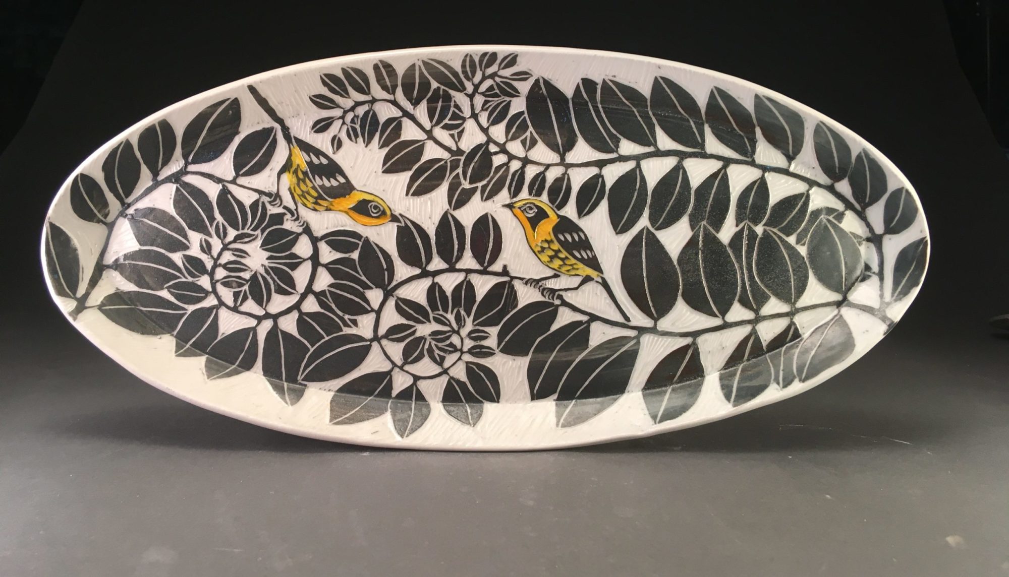
 and paint over them with blue. Karin immediately did a wonderful fern stencil.


 to encourage the slip to migrate onto the clay surface. Then I did it again with black slip.
 Actually I did a little more to it so it looks better.
 pressed into the slip before the slab is thrown out. Really, I was just trying to make a bowl to


 Scored both the edge of the pot and the underside of the coil and pressed it on for a nice finished look.
 mind you, I did still wet my pots down to absorb less glaze as I always do for Shaner’s Clear. Sure, my technique is automatic- I just need to get the right bucket!
 This looks like blue and red iron.
 You can see that it’s uneven. Also, the photo makes the clay just a bit more orange than it really is. (Nice photos by Guy Nicol)

 Under clear. If you check that last post you can see this pot bisked.